Friday, 18 January 2019

'Under The White Sun' - Graphics

GRAPHICS

I emailed 'Under The White Sun' about working on the graphics in this film as this is something I was interested in developing as it was something I think I already have an eye for.

After our initial meeting we created a group chat so that we could discuss ideas, keep updated and on target throughout the Christmas break.

I wish I had more time during the holidays to work on the graphics but unfortunately I had my contextual studies work to do and I prioritised this over any LCC Collaboration work. On top of this I was working on the graphics for 'One Night' so I felt pretty swamped.

Sebastian Chan (Production Designer) had created a folder on the google drive with existing posters for us to use as inspiration for the style of poster he wanted from us. The following are the ones I used as inspiration.


I wanted to create a poster with the colours and shapes presented in these two posters. I thought about the kind of posters you see in a bar and that started to get me thinking about 'Happy Hour' posters.

Left: Happy Hour poster. Google Images
Right: My Happy Hour poster
I added Seb's CSEC logo to the bottom to make the graphics more coherent with the rest of the film.

The second poster I made was inspired by a poster (left) I had found when doing some research into the rising sun. I wanted to create something that incorporated the iconic symbol from the old Japanese flag.

Left: Google Images
Right: My poster

I used Adobe Illustrator to create both of my posters. I had used Illustrator a lot on my Foundation course but not much since then. I was a bit rust and had forgotten a lot of the tools and what I was able to do but after some googling and checking the DMC website I was able to figure it out enough to do what I had wanted.

I am quite proud of how my posters turned out and was delighted to find that Seb and the team really liked them too.

'Under the White Sun' - Graphics

Seb also made some flyers for the film and one of them was a wanted poster that he had not yet put a photo on. He gave me the task of finding a photo and editing it into his flyer. It just so happened that the previous day my sister had sent me a passport photo of hers that looked perfect! (We had laughed at the fact she looked like a criminal.) I edited the photo so that it was in keeping with the style, presented it to Seb and he seemed happy with it.


Left: Photo of my sister.
Right: Finished Wanted poster.

I had a lot of fun doing these posters and I think overall I'm pleased with how they turned out. Seb thought they were "very cool" and the rest of his team described them as "sick" so I considered this a job well done.

Monday, 14 January 2019

'Sweet Changeling' - Jelly Experimentation

Sorrel, Vicky and I decided to experiment making jelly early on because we weren't sure how long they'd keep/how much gelatin we should use/how to put objects inside the jelly.
It's safe to say our first test was a disaster. After arranging the food inside the moulds we poured in the liquid and all the food would move and float around making it very hard to keep them in place. The colours came out great and if we could keep the objects in place I think they would look fantastic.
We all agreed to do more research and tackle the task again later. After doing some research and watching some Youtube tutorials I learned that the best way is to pour in the liquid in small amounts, then put it in the freezer for a few minutes before adding more. I also read a trick to make a more solid ballistic jelly. This made me realise we also needed a lot more gelatin if we wanted these jellies to be sturdy and not fall apart.
The final jellies were a great success due to our research! Picture of the final jellies are on the last page.


Julian Caldow - Concept Artist


Friday, 11 January 2019

'Sweet Changling' - Food Research

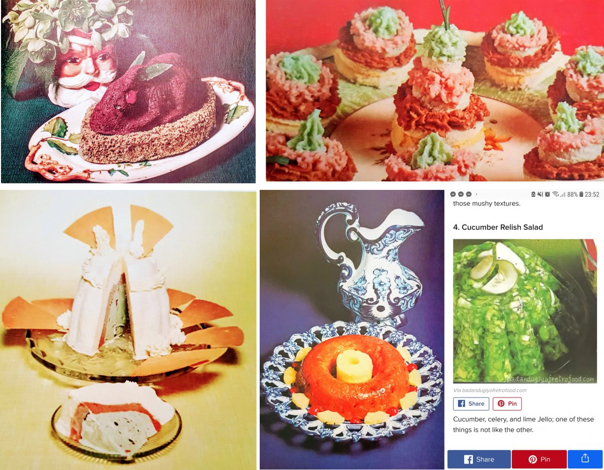
I asked my mum about popular dishes from the '50s-'70s and she told me about a facebook page that posts exactly the kind of tacky foods we were looking for. This was a useful research resource, some of them are pictured below but the link is also here: https://www.facebook.com/GetFestivewithFanny/


Sorrel made the moodboard below to help us research what was best for our dining room food. We decided on two or three jellies, prawn cocktails, coloured deviled eggs, a sausage cake thing and a lobster.


'One Night' - Technical drawings and rough model

VICKY'S ROUGH TECHNICAL DRAWINGS
Vicky drew these up straight after we had come back from surveying the location. This was a good idea because later on, I was struggling a little with understanding my notes.


COLOUR MODEL - CAD ELEVATION DRAWINGS
Above: Vicky's CAD technical drawings
Below: My CAD extended elevation that we printed to cut out the model pieces


SKETCHUP MODEL
Vicky also did a quick SketchUp model to see if it looked right in 3D in comparison to the photos.


ROUGH WHITE CARD MODEL
Vicky and I made a rough white card model to check if 1:20 was a good sized scale. It also helped us realise a few mistakes we made and ways we could make it easier for ourselves when doing the colour model. For example, the thickness of the Kapa foam was the same as how far the walls stuck out so we wouldn't need to cut out more pieces and it would look neater.


Monday, 7 January 2019

'One Night' - Location Surveying

Vicky and I went to survey the location of what will be the strip club for 'One Night'.

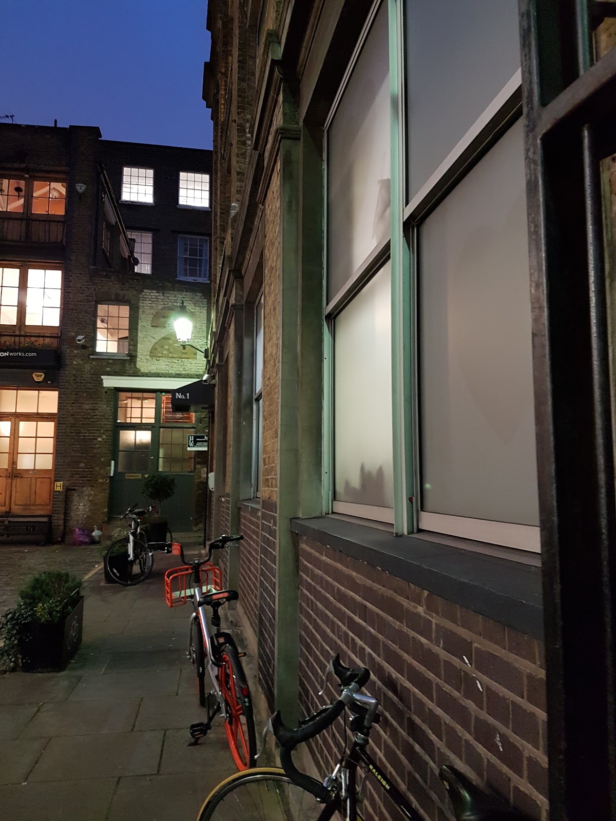
Photos of Location: Bleeding Heart Yard, Farringdon, London, EC1N 8SJ


We decided with the DOP that we would make a model of the building from the wall before the first window to the wall after the window around the corner and only go as high as the window ledge from the windows above.

Surveying Notes: